The London Periodic Table would use the API from CityDashboard which I created at UCL CASA. The proposed design would be inspired by
CityDashboard's grid view but would have an innovative look and feel that would be developed specially for this commission.
Other data sources, not already on CityDashboard, could potentially be added directly to the London Periodic Table.
CityDashboard collects and displays near-live open data from sensors, social networks and official data sources, pertaining to London. Data sources that update at least once an hour are used.
The London Periodic Table would use the CityDashboard API to receive its data. It would on an external server, for example the same server as CityDashboard, so that if data sources
become unavailable for a long time, or new ones become available, they can easily be switched. Essentially, the London Periodic Table would be a website, using HTML5 and CSS3 for animation,
that would update every minute, pulling in the latest information through the CityDashboard API, styling it appropriately. The website would be displayed in full-screen
mode in a web browser on a computer, the screen being a TV to maximise the impact.
Data sources used by CityDashboard and suitable for inclusion in the London Periodic Table include: weather station data, for example from UCL CASA's weather station in Bloomsbury, other
weather stations closer to Shoreditch could potentially be used if available and in an appropriate format; transport data from Transport for London, including Barclays Cycle Hire docking
station and Tube line running information; river level data from the Environment Agency or the Port of London Authority; pollution data from DEFRA or the KCL London Air project;
stock market index levels from Yahoo! Finance and collective mood indication from the LSE Mappiness project. Local data on pollution monitors, docking stations and tube lines
can be configured specifically to be relevant to the location of the ODI office.
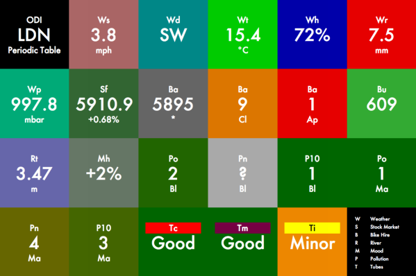
The style of the website, as shown in the mockup, references the classic design of a Periodic Table. Each data source would be displayed
in a square panel, with the value being predominant, an indication of what the value represents being placed above it, and units or other supplementary information being displayed below it.
The colour of the panel would correspond to how extreme the current value is. For example, dark green would be the "everything OK" state.
Temporarily unavailable data would be shown with a light grey background. Extreme events (e.g. very high rain levels) would result in a pulsating red square, catching the eye -
this can be seen in the animated version, linked below. The use of a capital letter (for the category) followed by a small letter (for the detail within the category) for each
panel's title, is designed to encourage the visitor to work out what the data represents, and mimics the element names on a traditional Periodic Table.
Image
Animation
A mockup can be found here. It does not update, but does have some animation highlighting extreme values.
It is based on data from a moment in the evening on 17 October. The shape adjusts with the size of the browser window.
Technical Needs
These depend on the space available, but a plinth or table, able to support the TV and house the computer and cabling, would be needed. Alternatively, the TV may be able to be wall-mounted.
As the key deliverable is a live-updating website, other mounting/display options can be considered. It is assumed that a stable wifi connection to the Internet is available.
Estimated Equipment Budget
TV (42" LED): £299
Mac Mini: £529
Secure table mount for Mac Mini: £46
HDMI cable: £10
Total: £884
Other equipment, e.g. keyboard/mouse for initial setup, can be borrowed. NB. Any required security
mounting for the TV is not included in the budget.